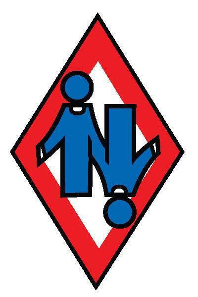
upndownshop 0 #1 October 12, 2007 Ok give me your honest opinion.... This company was owned by Bob Chaffin and Dennis Dorris back in 70's. The N was originally an up arrow and a down arrow connected. It was a scuba and rigging loft. 7 years ago I re worked it and this is what I came up with..I ran the SD Dallas gear store under this name. It will possibly will be the printing company for T shirts, keychains,marketing/promotional items etc.. Thanks for your input. J Quote Share this post Link to post Share on other sites
fallfast69 2 #2 October 12, 2007 Sorry, Jerry...it looks good, but kinda like a couple with a 69 going on. That logo would make me think it might be a sex shop...Jon Quote Share this post Link to post Share on other sites
namgrunt 0 #3 October 12, 2007 looks good but try replaceing the black with blue .59 YEARS,OVERWEIGHT,BALDIND,X-GRUNT LAST MIL. JUMP VIET-NAM(QUAN-TRI) www.dzmemories.com Quote Share this post Link to post Share on other sites
Glitch 0 #4 October 12, 2007 Quote...but kinda like a couple with a 69 going on. That logo would make me think it might be a sex shop... So how is this a bad thing? It grabs your attention and would prolly garner a peek out of curiosity if nothing else. It's memorable, appropriate to their business, and once the person understands the business behind the logo then it's all good. I give it a thumbs up...Randomly f'n thingies up since before I was born... Quote Share this post Link to post Share on other sites
shropshire 0 #5 October 12, 2007 Nice. I like it. (.)Y(.) Chivalry is not dead; it only sleeps for want of work to do. - Jerome K Jerome Quote Share this post Link to post Share on other sites
upndownshop 0 #6 October 12, 2007 Quote Sorry, Jerry...it looks good, but kinda like a couple with a 69 going on. That logo would make me think it might be a sex shop...Jon No, that would be I.O.S. In and Out Service lol Actually I found that many skydivers saw it as a compressed according. Freefly or belly, this way not playing favorites to either, So hmmm sex shop, well there will be an Adult" section for certain T shirts. So maybe you have a good point. I do appreciate your opinion. J Quote Share this post Link to post Share on other sites
jtval 0 #7 October 12, 2007 Meh, It looks ok. I hope you don't mind I took the liberty to Spice it up to my liking. What do you think?My photos My Videos Quote Share this post Link to post Share on other sites
upndownshop 0 #8 October 12, 2007 Quote Meh, It looks ok. I hope you don't mind I took the liberty to Spice it up to my liking. What do you think? Well that should get a few "hits" Nice! Quote Share this post Link to post Share on other sites
jtval 0 #9 October 12, 2007 LOL. I like the logo. I think eventually the "N" would be good product recognition.My photos My Videos Quote Share this post Link to post Share on other sites
upndownshop 0 #10 October 12, 2007 Quotelooks good but try replaceing the black with blue . That was actually used on the side of a rig, its the only file of UNDS on this new laptop. There are about 6 rigs out there with UNDS, got to see them all in the last 2 years with my travels. Its really good with a colored font. RWB would be nice, might just make that the official colors.... Quote Share this post Link to post Share on other sites
upndownshop 0 #11 October 12, 2007 Quote LOL. I like the logo. I think eventually the "N" would be good product recognition. Thank you, thats my goal... So give ya a free tshirt if you put the N on your ring cover? Quote Share this post Link to post Share on other sites
jtval 0 #12 October 12, 2007 I would but i think it would be cheaper to buy a tshirt. Which rig cover? you mean the pin flap? My photos My Videos Quote Share this post Link to post Share on other sites
upndownshop 0 #13 October 12, 2007 Quote I would but i think it would be cheaper to buy a tshirt. Which rig cover? you mean the pin flap? sorry, meant ring cover, or mud flap. Last time I had one removed and replaced it was $50.00, Im sure I got it cheap. So yeah buying a shirt would be cheaper. But I do have a digital printer that will do any image like your personal photos and holds same quality as the heat print. I think I am going to enjoy the heck our of this adventure. Quote Share this post Link to post Share on other sites
gonzalesna 0 #14 October 12, 2007 I like it as is. Some people refrain from beating a dead horse. Personally, I find a myriad of entertainment value when beating it until it becomes a horse-smoothie. Quote Share this post Link to post Share on other sites
fallfast69 2 #15 October 13, 2007 So maybe you have a good point. I do appreciate your opinion. J That's what I'm here for...no chargeJon Quote Share this post Link to post Share on other sites
BIGUN 1,111 #16 October 13, 2007 FWIW... Me likey. Have you considered doing it with a sky blue or little darker blue to compare to the red?Nobody has time to listen; because they're desperately chasing the need of being heard. Quote Share this post Link to post Share on other sites
upndownshop 0 #17 October 13, 2007 QuoteFWIW... Me likey. Have you considered doing it with a sky blue or little darker blue to compare to the red? Yeah, this was the only file of it I had on this laptop. I will change the colors, the N looks better in color I think. (still waiting to hear back from the city, will try again Monday then call you) Quote Share this post Link to post Share on other sites
usedtajump 1 #18 October 14, 2007 Jay, why not go with the original logo? The older I get the less I care who I piss off. Quote Share this post Link to post Share on other sites
councilman24 36 #19 October 14, 2007 Took me awhile to realize they were heads and not dots on the top of i's. I was trying to figure out where the 'in' came from. But I'm old and wearing trifocals. I'm old for my age. Terry Urban D-8631 FAA DPRE Quote Share this post Link to post Share on other sites
longtall 0 #20 October 15, 2007 and for awhile in Albuquerque............................J..." 90 right, five miles then cut."---Pukin Buzzards Quote Share this post Link to post Share on other sites
billeisele 123 #21 October 15, 2007 I like it as it is, looks good, the logo will mean a lot of different things depending on who looks at it you've already said you would play with the colors you could try adding dots for eyes and nose and the smile, don't know if that woudl make it better or worseGive one city to the thugs so they can all live together. I vote for Chicago where they have strict gun laws. Quote Share this post Link to post Share on other sites
upndownshop 0 #22 October 16, 2007 Usedtajump QuoteJay, why not go with the original logo? Yeah, you know I like the original, but I felt it needed something. Ill see if I can find the original. councliman24 QuoteTook me awhile to realize they were heads and not dots on the top of i's. I was trying to figure out where the 'in' came from. It really is two arrows in opposite directions, maybe I need to make them more definative..... Quote Share this post Link to post Share on other sites
happythoughts 0 #23 October 16, 2007 Where you at? Quote Share this post Link to post Share on other sites
upndownshop 0 #24 October 16, 2007 Quoteand for awhile in Albuquerque............................J... So....... Give me a history lesson, what did I miss?.... I remember making wallets, can koozie's (now SunPath's )packing student rigs, cutting ribs for his canopy designs. J Quote Share this post Link to post Share on other sites
upndownshop 0 #25 October 16, 2007 Quote I like it as it is, looks good, the logo will mean a lot of different things depending on who looks at it you could try adding dots for eyes and nose and the smile, don't know if that woudl make it better or worse thanks. I played with helmets and eyes, might look at that again.....just had another idea.thanks again seems like a few dont know what it is....thus raising curiosity, maybe I should leave it as is, just add color? Quote Share this post Link to post Share on other sites