BMFin 0 #1 February 25, 2009 I just saw the strong calendar 2009. WOW was I suprised to see how the calendar looked like. I´ll be honest here: It looked horrible. Seriously. Im sorry to say this but thats what it really looks like. Not to offend any photographers featured in the calendar, I will just comment what was done with my photo: The photo, which was originally a horizontal composition, had been rotated 90 degrees as vertical and then actually streched to fit the horizontal propotion of the calendar. Yes, you heard me right. It was streched without constraining propotions. At first I though, this must be a mistake. The print subcontractor must have made a mistake on the printing process. After taking a look at the whole layout of the calendar it became quite evident that the printing process most likely has no part in this. This is going to be the last time I send my photos to be published by someone of whom I cannot be sure that they know at least the basics of graphic design. I hate to have my photo ruined and then published with my name on it. No thanks. I cannot understand how a company such as Strong enterprises can afford not to have someone do the layout properly. Quote Share this post Link to post Share on other sites
Laszloimage 0 #2 February 25, 2009 We all went through this... strange cropping, unreal colors in the printing, and so on... Not only Strong's calendar, but all publications. My story with this practicular calendar is I allowed them to use my image since they said it will be handed out for free. But they wanted me to sign a full release of the image and grant all rights to Strong Enterprices. Of course I denided that. My image wasn't "destroyed" in this calendar though Quote Share this post Link to post Share on other sites
velocityphoto 0 #3 February 25, 2009 The last photo i had in parachutist was trashed as well. dec page 59 They ruined the color in it and cropped it all funky. A friend will bail you out of jail , a REAL friend will be sitting next to you in the cell slapping your hand saying "DUDE THAT WAS AWSUM " ................ Quote Share this post Link to post Share on other sites
BMFin 0 #4 February 25, 2009 Yeah. Yours looks nice. Its a very nice photo, not taking into account the Zhills logo which was stamped there without any kind of effort to resize it poperly. (which ofcourse is not your fault at all). I also denied the full release of the photo. Basically I thought that submitting the photo may promote our DZ and therefore I was willing to hand it out for free to this calendar. Would I have known the calendar will look like it was put together with MS paint I would have kindly just said no. Im sure this may happen with other publications too, but after this Im gonna be more carefull with this. Anyways there are some professional publications out there too, like parachutist for example. For the march 2009 issue, they had decided to rotate a photo of mine about 6 degrees to the right and they sent me a PDF file to show me how it will look like and asked me if Im ok with it. It looked great and I was happy to reply I was OK with it. This is how it should be done when any alteration is done to your photos. Colors can be difficult to match sometimes, since it also depends on your own monitor also how your photos look like when you edit them. Personally I dont have a top of the line calibrated monitor, so I accept the fact that when printing the results may differ in terms of colors from what I had intended them to be. But honestly I must say I was disapointed to see my photo streched the way it was.. Quote Share this post Link to post Share on other sites
linestretch 0 #5 February 25, 2009 Since i have no desire to get a strong calender....can you post the shot?my pics & stuff! Quote Share this post Link to post Share on other sites
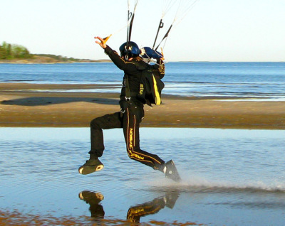
BMFin 0 #6 February 25, 2009 Quote Since i have no desire to get a strong calender....can you post the shot? I dont have a scanner availeable right now, and I think the only way to really see the result is to look at the actual print. I can post the original picture though. You can easilly imagine how it looks like if you rotate it 90 degrees and then strech it really a lot, to fit the horizontal layout of the calendar. I think even a child understands you simply cannot strech photos like that to have them fit the page. And what makes it even more disturbing is the fact that I sent the photo to them edited as a horisontal composition. (like it is here as an attachement) IMO it works best as horizontal and thats the way I ment it to be. I dont understand why would they first flip it to vertical and then strech it to fit horisontal again.. Quote Share this post Link to post Share on other sites
kefran 0 #7 February 27, 2009 wierd !-------------------------------------------------- I never used 2 rocks to start a fire ... this is called evolution ! Quote Share this post Link to post Share on other sites
billvon 2,400 #8 February 27, 2009 Because they needed to fill the page and they thought it would look good. That's one of the issues when you send your photos _anywhere_ whether you are paid for them or not. They might take your awesome picture, ratchet the contrast way down and use it for a background. It might end up as a postage stamp in the corner. It might be morphed to fit a layout (i.e. "wrapped around" a wind tunnel or something.) It might be stretched and the color tweaked to fit in with another sort of layout. A good reminder to not send your pictures to customers (paid or not) if you don't want them messed with. Quote Share this post Link to post Share on other sites